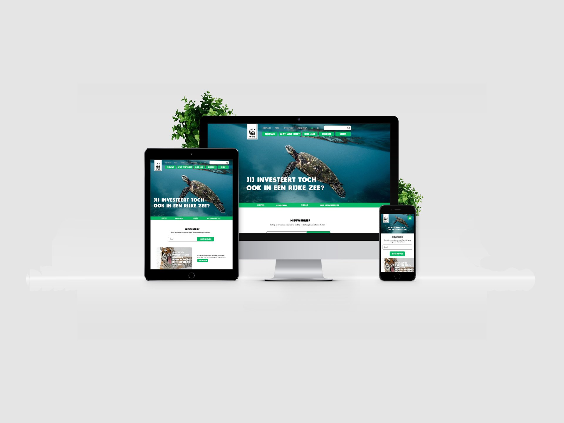
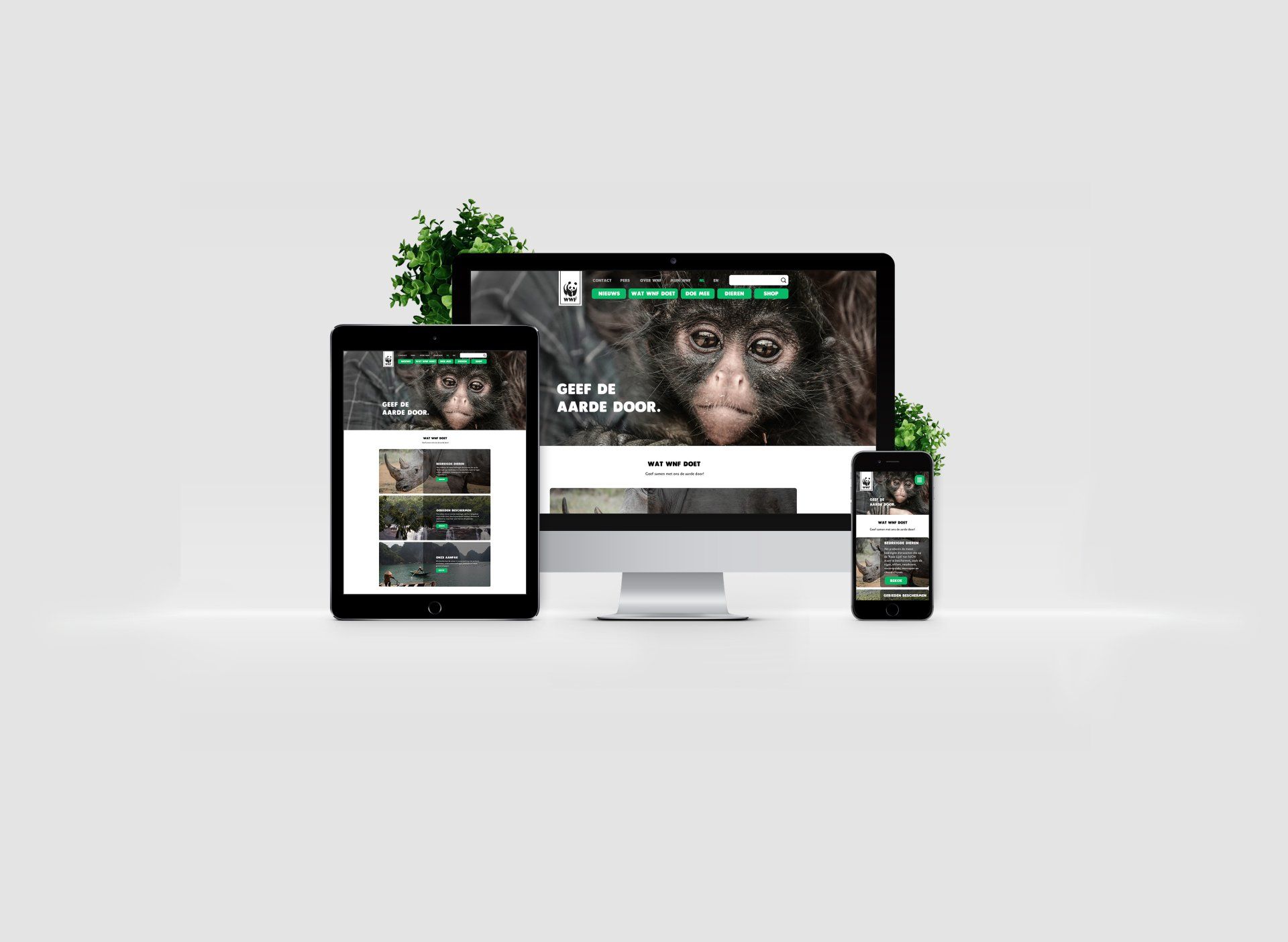
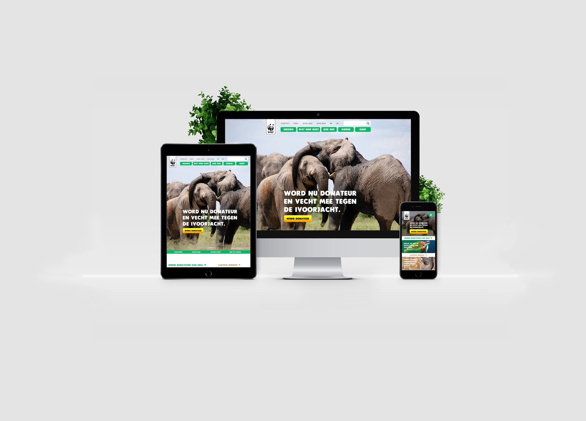
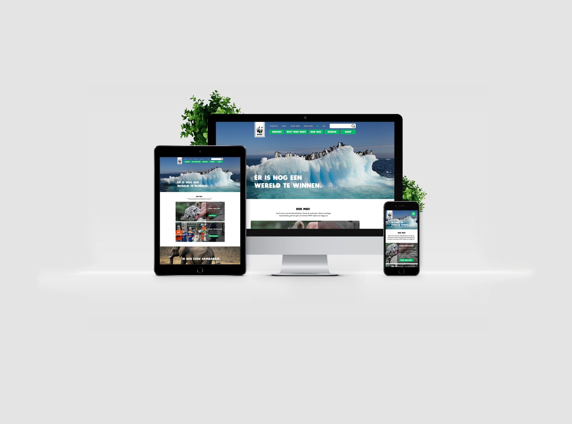
WEBDESIGN
During my first internship, I selected a website that I believed could have a stronger message and greater impact on people if I redesigned it myself. I chose the World Wildlife Fund (WWF) website, focusing on enhancing its emotional appeal and effectiveness in driving donations. To achieve this, I prioritized the use of powerful imagery that evokes empathy, aiming to inspire visitors to take action and contribute. Additionally, I improved the structure and clarity of the website by implementing a consistent color scheme and using high-contrast, attention-grabbing colors for key Call to Action (CTA) elements, such as the "Donate" button.
At the time of this project, my knowledge of web accessibility was still limited. As a result, I did not yet fully consider contrast ratios, color choices, and other accessibility best practices. Looking back, I recognize that some design decisions—such as certain color contrasts or text readability—could have been optimized to better accommodate users with visual impairments. This project was an important learning experience that later helped me develop a deeper understanding of inclusive and accessible design.
Below, you can see how the original WWF website looked in 2018, the year I undertook this project (as the website naturally evolves over time).