REBRANDING SUDOCREM
Why Sudocrem?
- Masculinity, to align with the new target group.
- Winter sports, to create familiarity and appeal.
- Simplicity, to reflect the no-nonsense nature of the product.
Brand strategy
Brand Positioning – From Baby Care to Winter Sports Essential
Historically, Sudocrem has been associated with baby care and sensitive skin treatment.
The new brand positioning would transform it into a rugged, masculine, and performance-driven
skincare product, ideal for protecting the skin in extreme weather conditions.
New Identity: Sudocrem as a protective skincare solution for male winter sports enthusiasts.
Core Value: Reliable protection against cold, wind, and sun exposure.
Differentiation: Unlike standard moisturizers, the product would be marketed as a no-nonsense,
specialized, high-performance protective cream for harsh conditions.
Target Audience Analysis – Understanding the New Consumer
The ideal customer is a young, active man (18-35 years old) who regularly engages in winter
sports like skiing and snowboarding. This audience values:
- Performance-based skincare rather than cosmetic appeal.
- Minimalistic and effective products with no unnecessary additives.
- Convenience and portability for easy use on the slopes.
Visual Identity & Branding Elements
The new brand identity must reflect masculinity, winter sports culture, and no-nonsense efficiency,
while still maintaining Sudocrem’s brand recognition.
Color Palette
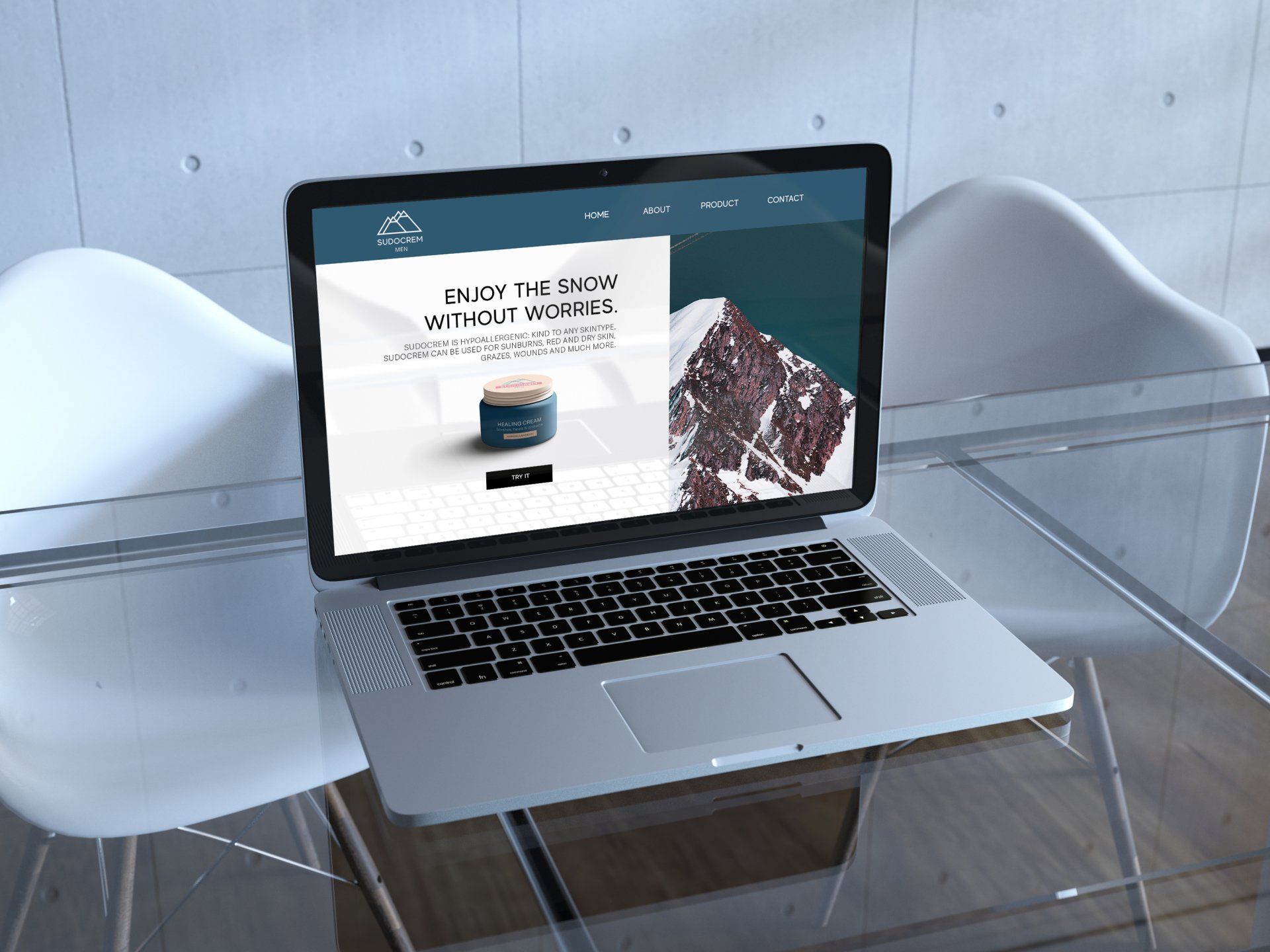
Primary Colors: Dark blues and icy whites (representing winter and extreme weather).
Accents: Bold reds or oranges (symbolizing energy and adrenaline).
Brand Recognition: The classic white letters on a red background remain to ensure familiarity.
Typography & Logo
A strong, bold typeface that reflects reliability and confidence.
The Sudocrem logo remains recognizable but integrates subtle design elements like sharp,
angular edges to reflect mountains and dynamic movement.
Packaging & Product Design
Compact, travel-friendly packaging for easy use on-the-go.
Modern, rugged design that appeals to a male-dominated sports audience.
Weatherproof labeling with emphasis on protection against windburn, cold, and sun exposure.
Messaging & Communication Strategy
The new brand messaging must shift from baby care to extreme weather skincare:
Brand Tone of Voice
Confident, straightforward, and action-oriented (e.g., “Don’t let the cold slow you down.”).
Minimalistic yet informative, focusing on protection, endurance, and efficiency.
Marketing & Social Media Strategy
Partnerships with winter sports influencers & athletes to demonstrate product effectiveness.
Video ads showcasing the product in extreme weather conditions.
User-generated content campaign encouraging skiers and snowboarders to share their
experiences with the product.
Since this project was my first deep dive into Brand Identity Design, the focus was primarily on research, strategy, and implementation, rather than creating highly refined visuals. At this stage, my visual execution skills were still developing, and my main goal was to understand how branding decisions shape audience perception.
The project was designed as an exploratory experience, allowing me to experiment with branding principles for the first time. This meant analyzing target groups, color psychology, typography, and positioning, and applying those insights to my redesign. While my visual work may not have been as polished yet, the project gave me a strong foundation in strategic design thinking—a skill that continues to influence my approach to branding today.


